Ecommerce A/B Testing Ideas Part 1
Ecommerce is such a mess. Giant hero images, pop-ups asking for email addresses and too much distance to value. Below are three wonderful ideas to keep your visitors happy and converting. You might not be ready. It will require you to take a break from office politics, empire building, stabbing people in the back, and think about your visitors – for once.
Ecommerce A/B Testing for Your Home Page
A grocery store is formulaic. Flowers by the entrance, vegetables on the perimeter, meat in the back. It’s a great heuristic – everyone knows how to get what they want – pay and leave. Something went wrong with ecommerce websites –
- Giant hero images: Useless. Popup windows asking for an email address: Not the reason for my visit. Items to purchase only found after playing twenty minutes of whac a mole with my mouse: embarrassing.
- Value, to the end user, is providing the same contextual view as walking into the grocery story. A/B test removing all the clutter. Highlight categories so the visitor can contextualize where they need to go.
- They arrived for a reason, so help them get there. For example, if you sell shoes highlight useful categories: Men, Women, Boots, Heels, Running, and so on. Give visitors the direction they are looking for. Or don’t. Who cares. We ran an A/B test like this on a home page and increased sales by 55%.
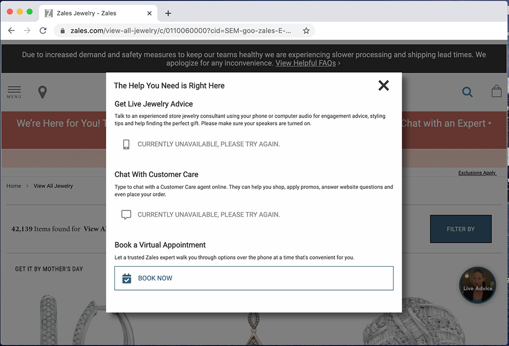
An example of Zales forcing me to play Whac A Mole
Ecommerce A/B Testing for Your Product Page
2: Product pages. You are doing it wrong. And that is why everyone drops off on this page – It’s no secret. But why are you so eager to accept it?
- Product pages are the life source of ecommerce. Create an army, rally around this part of your customer journey and start A/B testing.
- The solution to this problem isn’t tactical, its philosophical. Who in your organization, is challenging your team to constantly run A/B tests on product pages?
- Not 1 A/B test. Many A/B tests. Not many a year, but many each month. By shifting your ideology to focus on this area, with relentless iteration, will surface deep insight.
- And then you will understand what your visitors are responsive to. This will drive them further down funnel. Think it’s a horrible idea? It probably is. Ignore it. When we implemented this strategy, we drove 65% more visitors down funnel. In tow we generated a 6% increase in sales. Annual bookings were half a billion annually.
Ecommerce A/B Testing for Your Checkout page
3: Traveling further down the funnel – What about checkout abandonment? Good, let people abandon, but before they do, ask for their email address.
- For example, review your funnel reports. Understand where your visitors drop off.
- Before that step gently prompt visitors to provide their email address. This now enables your team to fight cart abandonment with email automation.
- This is useful for your visitors. Think about it – If you left anything anywhere, isn’t it useful to be reminded of it?
- A/B test various ways of obtaining email addresses and later A/B test different email campaigns to bring visitors back. Sounds like a hassle? How? It’s automated.
Puffin.io is A/B testing software for websites. Looking for an A/B testing tool. Learn more about us here.