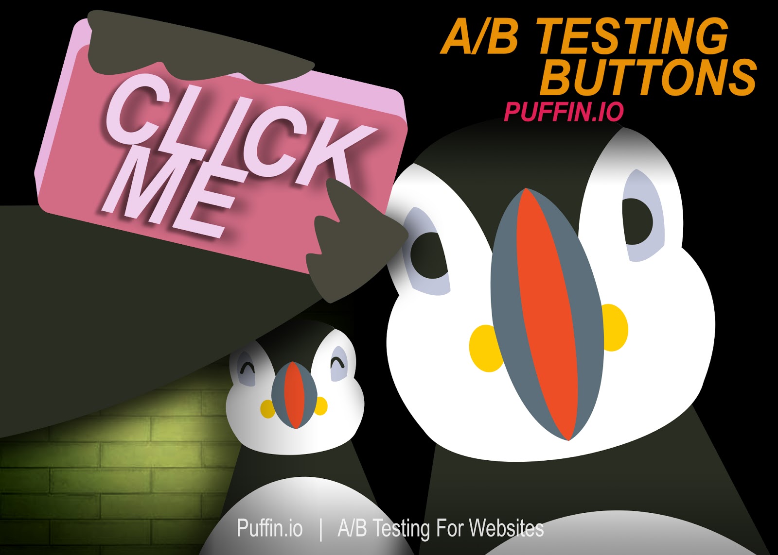
A/B Testing Buttons
A/B testing buttons? Original, no. Effective, yes. If you are looking for bigger, bolder A/B tests that’s great. But to convert, a visitor must always click a button.
Free: A/B Testing Buttons
If your site is free, say it. And the best place to say it is on your button (CTA). For example, your button CTA should read “Free”. Free is a great reminder for the end user – risk is low. Hopefully with the right product the value is high. Try various CTAs when a/b testing “Free”. That is, “Try for Free!”, “TRY FREE!”, “Try free now”. Subtle differences, yes. Will it matter often times it does. Give it a shot and you will be surprise how much a call to action matters.
Contrast: A/B Testing Buttons
With various design patterns and styles buttons can often not look like buttons. If you have a designer who is passionate about composition, flat design, awful material design, remind them that buttons should always have a juxtaposition to the rest of the page. For example, conversion is having your visitors click a button, if this isn’t visually evident how will they know what to do? Try A/B testing contrasting buttons to increase CTRs. If your button sticks out like a sore thumb and makes your page look ugly – then you know you are doing it right.
Size matters: A/B Testing Buttons
The world has a vast landscape for presenting buttons today. Desktop, tablets, mobile all with their own view. Visitors consuming information is not always optimized for their device. Buttons get lost and not designed for those who might be clicking or tapping. For example, mobile visitors will make up 50% of your traffic, if you are not optimizing buttons for this traffic source, you will miss out on clicks that lead to conversions. Try A/B testing button size for the appropriate device to get your visitors to convert.
Expectations: A/B Testing Buttons
When designing a CTA we want to focus on expectations and outcomes. Incentivize your visitors by letting them know what is in it, for them. For example, “Submit” isn’t an incentive, it’s a poor CTA. “Search”, “Check Availability”, “Show Price”, “Confirm Booking” are better incentives to get visitors to convert. Try A/B testing clear expectations and outcomes with your next button A/B test.
Location: A/B Testing Buttons
“No, click here”, “Wait, scroll down and click” are all the reasons why the location of your button is important. Essential call to actions should be placed above the fold, it gives visitors clarity on what is the priority. For example, try A/B testing various locations of your buttons to ensure visitors have clarity on how they can move forward to the right course of action. Think it doesn’t matter? It does.
Size, location, incentives, juxtaposition and CTAs are all great things to consider when A/B testing buttons. Unoriginal, yes. However, visitors must always click a button to convert. It’s why great growth practitioners always revisit this tactic – because they work.
Puffin.io is A/B Testing Software for Websites. Looking for help setting up your next A/B test? Let us know.